Saturday, December 29, 2012

Not By Bread Alone

And the word of the LORD came to him: “Depart from here and turn eastward and hide yourself by the brook Cherith, which is east of the Jordan. You shall drink from the brook, and I have commanded the ravens to feed you there.” So he went and did according to the word of the LORD. He went and lived by the brook Cherith that is east of the Jordan. And the ravens brought him bread and meat in the morning, and bread and meat in the evening, and he drank from the brook.
1 Kings 17:2-6

We are coming upon the new year, and I thought I would do one last post before 2012 is ended. It is a piece that I was inspired to do based on my graphic novel Elijah. I haven't been able to do much on my graphic novel for various reasons, but the past couple of weeks I've gone back to my ideas and began brainstorming and working on it. Thankfully, I was able to solve some problems I was running into which lead to me be inspired to take it up again. So, God willing, it is my full intention to really pursue my graphic novel in 2013 and to see if I can finish it within the year. It would be so exciting if I could! For now, I have this piece which I've entitled Not By Bread Alone. Keeping with my inspiration from Amano, I came up with this character piece of Elijah  of the scene where he is being fed by God through ravens at the brook Cherith.


With the movement and the abstraction of the composition, I wanted to achieve a feeling of suspension and serenity considering the scene being depicted. The word of the Lord has come to Elijah to keep himself hidden from King Ahab for a time. There the Lord, by His grace and power, sustains and protects His servant by the brook and the ravens. The surrealistic quality of the water, ravens, and Elijah flowing as one element creates that ethereal atmosphere of a prophet being fed by his God. For it is not merely the physical needs that are being met, but that through this miraculous act of ravens, it shows that it is not by bread alone that we are to live, but by the Word of the Lord; for it was by the word of the Lord that these ravens had come.

It might look as if I had done this image in pen to create the line work, but I actually did this piece all in pencil first. The shading of the ravens behind him and all the lines are pencil work. I then went into Photoshop and did the rest of the coloring and manipulation there. I actually love a lot of the techniques that are used for pen, but I've never been able to get used to the pen itself. So, lately I've been using pen techniques with my pencil work, and have been pleased with the results. As for this piece, I wanted to use those pen techniques to achieve that two-dimensional look. This is a lot like the Japanese woodblock prints that I've discussed before on this blog, but with the texture I've added and the coloring, I've also noticed that it is like the medieval illuminated manuscripts as well. The golden hue of this piece has that glow of the gold leaf that the monks used in their manuscripts at the time to achieve that feeling of the heavenlies. The art of illuminated manuscripts, just like with Art Nouveau, is always there subtly influencing my work.

Well, this is a short post, but as I said, I hope to be posting progress on my graphic novel soon. I hope you all have a Happy New Year!


But he answered,
   “It is written,
“‘Man shall not live by bread alone, 
          but by every word that comes from the mouth of God.’”
Matthew 4:4

Saturday, October 27, 2012

Illustrations: Pippi Longstocking

Yes, now I can do another big post! September and October have been full of life, and it is hard juggling all my projects, but I can now show you what I've been doing for a client of mine. I've been doing work for her for over a year now, and most of it has entailed organizing and editing all her photos of her daughter and compiling them together into photobooks. I've done work on a the photobook of her daughter's first year, and now I've been working on her daughter's second year. My client and I thought it would be fun for me to do illustrations as well that could be placed throughout the photobooks as part of the whole design. She knew of my talents and interests in illustration work rather than working with photographs, which is why she I came up with this idea. We did that with her First Year, but in doing the Second Year we decided to push it a little farther. Her daughter adores Pippi Longstocking and carries her little dolls of Pippi and her friends everywhere. She knew that it was something very personal to her daughter and would accurately reflect her second year. With that theme in mind, I decided to come up with my own design of Pippi Longstocking. She is a very popular character, with many different variations of her look, some of them better than others, and I thought I would give my hand in coming up with a concept of this iconic character. I knew it would be an opportunity for me to develop my skills in concept design and something I could use for my portfolio.


I started out with these simple sketches, just playing around with ideas and face shape. I really wanted to do something that would reflect the character, but not make her too awkward like most illustrations of Pippi are. I wanted to show her eccentric, boisterous, and confident personality without it being too garish. My knowledge of the character and her stories was limited, but I've read up on Pippi's backstory and the sort of things that make up her character. She isn't an orphan, but her father is gone most of the time since he is a buccaneer captain, so she spends all her time raising herself and being self-reliant. She has adventures with her friends, forging her own way, outsmarting adults, and causing quite a bit of mischief, though she is well-meaning and friendly. She is a big personality and for some reason she has superhuman strength on top of everything else (inherited from her father). So, I really wanted those strong characteristics to come through.

First Concept of her face.


After doing those initial sketches, I went straight into developing her character. As you can see, what I'm choosing to highlight is her hair, which is one prominent feature, and her clothing, which I think is best in reflecting her personality. Remembering how it was when I was a little girl and being highly imaginative, I liked to collect things that I found while playing with my friends, or I liked just collecting things in general, i.e. cards, marbles, rocks, scarves, etc. I thought that since Pippi was an adventure with a big imagination, she would collect strange things and stick them in her pockets. I also wanted to give her a more old-fashioned looking outfit, with the large skirt and button-up shirt and big, Victorian-styled shoes. As far as I know there is no particular time period that the stories take place, but seeing as the books were published in the 40s and many of the illustrations done are very vintage-esque, I thought I would make the design more old-fashioned than modern. I also thought in giving her a bigger skirt it would create more body to her design and showcase her strong presence. Oh, and another element to her look that I added was the two little pins on the front of her jumper. They are of an anchor and a ship's wheel. I thought this would represent the idea of her father being a captain and how she had lived for most of her early life on that ship before her father bought a house and had her live there thinking that life on the sea was no place to raise a daughter. She loved that life, though, and apparently is a better sailor than most of her father's crew. Having those pins, then, represents that part of her life, which I think isn't readily known about Pippi Longstocking in general. And then, of course, I have her wearing her longstockings.

Final Concept of her face.

After doing the three above sketches, I went ahead and started on my first illustration. However, when I showed it to my client she thought she looked too old. She is supposed to be around 9-10ish and my concept made her look more like a teenager. I agreed with her and went back to redevelop her face. I then came up with the above sketch, which I'm very happy with. I think it expresses her mischievousness and youth. So even though I had done an entire illustration already, it ended up not turning out as well as I had hoped. I was glad, then, that I went back and redeveloped Pippi a little bit more and pushed to have more expression in her face. Looking back now on my initial sketch of Pippi's face, she doesn't have as much life or depth as I was able to achieve after my redevelopment. It has taught me that sometimes, though it may seem I have achieved what I wanted, it might take another pair of eyes or putting it away and returning back to it with fresh eyes to really observe flaws of a piece. I thought it was very helpful to me in my growth as a concept artist.

Without further ado, then, I give you two illustrations I have completed! 


As you'll notice, I have drawn Pippi holding or carrying certain things. This is to make these illustrations personal to my client's daughter. They are things that I incorporated that were what her daughter did during certain sections of the photobook and of her second year. Such as, the second illustration Pippi is holding the flags of Finland and Sweden because my client went with her husband and daughter to spend several months there as a vacation, so this is something that would be meaningful to her daughter, particularly when she is older and look back on that time spent there. Other things include an Easter egg bag or water hose, which represent for that particular section of the photobook, i.e. my client's daughter's Easter as well as the fun time she spent in the hose because she really loves playing in the water. I will be doing this with the rest of the illustrations that I create. It adds that personal touch that will make this photobook special and memorable for my client's daughter. 

I will be posting more illustration work as I go, so there will be more coming up! For now, I hope you enjoy these.

Coming up next: My Avenger's Project: Red in the Ledger. :-)

Monday, October 15, 2012

Leaves and Cactus

For me this month has been full, and I'm still plugging away at my projects. Hang in there, you shall be seeing more stuff soon! In the meantime, I have done some more nature sketches that I can share with you. Yesterday I went with my sister and her fiance to Boyce Thompson Arboretum just outside Superior, Arizona. It is a beautiful desert landscape garden with trails and other recreation activities available. It has a small forest of Eucalyptus Trees, a cactus garden with every sort of cactus you can imagine, twisting and piled high rock formations, desert nooks and crannies, and even a sweet little herb garden. There is so much to look at and explore there and is a perfect place to find a little hideaway spot to just draw. Another point of interest is the large mansion-like house of the Boyce Thompson family that was built when they purchased the land in the early 1900s. It is situated grandly on top of a cliff that plunges into a ravine filled with large trees and foliage. I do not know much on the history, but I do know that they built an elevator within the cliff itself that would take them down right into the ravine. I thought that was really neat. Needless to say, I love visiting this place and spending most of the day with my pencil and sketchbook under the shady trees or overhanging rocks.


In these three sketches that I did I applied the same techniques I was speaking of in my last nature post. What I did was I found something that interested me and I would do a quick, rough sketch of the subject. However, instead of continually referring back to the subject as I would sketch, I would rely on my imagination for the rest of it. This way I would keep the piece more conceptual than literal and I could focus on composition and other aesthetics. It has served me well to do this and pushes me to interpret reality in a way that would capture the "spirit" of the subject more fully. I'm happy how these came out. I hope you enjoyed them!

Sunday, September 23, 2012

Sundown In Retrospect

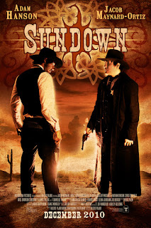
The Official Sundown Poster
Copyright 2010 Danielle Pajak Illustrations
and Phoenician Pictures
 September is well on its way to being over, and I am pretty busy working away on my projects. Other than my last post, I hope to have an update on my current projects soonish, but for now I wanted to blog about a past project. It was 2 years ago in the month of September that my cousin, Alexis Johnson, and a group of friends, who were fellow film enthusiasts and professionals, came together to create a short film. My cousin and I are an inseparable duo, both passionate for the art of film and plan, as much as possible, to make films together. I had previously helped her with a film that she did while in college, and it was on that project that we had come to know a group of talented people who were hardworking and great colleagues. Desiring to do another project with the same group, my cousin was instantly struck with an idea to do a western, and thus Sundown was born.

A short story about a young sheriff set in an old town of Arizona presented to us exciting challenges. Where could we film? How would we get costumes? How could we do this all in the smallest budget possible? True, living in Arizona gave us tons of resources at our fingertips, but trying to make it look authentic as we possibly could was not easy. How it all came about was truly remarkable and could not be done without our amazing cast and crew. Preproduction was full of ups and downs. We couldn’t hold onto our actor for one of the roles, finding authentic button up shirts, vests, and a dress for our leading lady was difficult, and then making sure we could have access to good equipment was a feat in itself. Even on our first shooting day when we were at our location (an authentic old western town called Rawhide) was met instantly with some trouble as one of the Rawhide representatives who knew of our plans was laid off and someone else had replaced her. Yet by the Lord’s grace each obstacle was overcome; a good friend of one of our leading actors stepped into the much needed role, by much diligent searching and the generosity of actors Greg Bronson and Dawn Nixon we had our costumes, the resources of our Producers Aiden Chapparoni and Matt Barr enabled us to have good equipment, and even though the representative had been laid off, Ed Vanderlee (part of the Arizona Roughriders at Rawhide) who became our overseer ended up being one of the biggest blessings to our movie. It was by his generosity that we were able to have real guns and bullets, and our actors were taught to shoot and die convincingly (this was done ON shooting day, so an excellent example of the talent and hardwork of our actors). Ed Vanderlee was even able to get us some extra shooting time at Rawhide, even though we had only scheduled two days! It was amazing how the Lord orchestrated this project, from the donation of horses (and riding lessons!) from a good friend of my cousin's to the bringing together of a cast and crew who were willing to be pushed hard in an unforgiving time crunch. Through all the stress, 100-degree weather, and obstacles, we were able to create something that was wonderful and memorable. Our actors, crew members, photographers, and extras were all what made this little movie possible and it was truly one of my best experiences. And that’s why I love the movie business!

My role in Sundown was primarily as Art Director. I did the poster design, production photography, concept art, storyboards, and some prop design. I do want to keep my blog focused on concept art and illustrations, but seeing as I love doing movie poster art and my illustrative background is used much in my poster design, I will also put the poster work I did for this film along with my concept work.

                    
Left: Zane Ulysses, the protagonist. 
The intense young sheriff played by Jacob Maynard-Ortiz 

Right: Saul Copper, the psychotic antagonist, who was put into prison by Zane and is seeking revenge. Played wonderfully by Adam Hanson.
Left: Delilah Rose, the sweetheart of the sheriff,
played by the lovely Alli Bakken.

Right: Sam Duncan, the wise and loyal friend of the sheriff,
played by Radcliff Misseri.


The following are a variety of storyboards, not all of them that I did, but a good portion. 

The first scene of the film, a flashback as Zane gets ready for the new day.
Meeting the characters. Saul Copper returns!
The fighting begins! Delilah is taken hostage and Sam saves the day. 
Sam dies. Zane cleans himself off and rides to save Delilah and deal with Saul! 
The final showdown! Zane and Delilah ride off into the sunset.

Below is an example of a prop that I did for the film, the Wanted Poster of Saul Copper. I thought I would post it up since it incorporates illustration. I did the sketch myself to make it look like the printed likenesses of the old western wanted posters.


The character posters:


All posters Copyright 2010 Danielle Pajak Illustrations

As you can see, I really desired to capture the look and feel of an old western, but with elegant twists. I used rich, warm tones, high contrast, and emphasized the glow of the setting sun. The Sundown logo, which can be seen on the official main poster as well, was the concept of my cousin's that I have used as a focal point; the setting of the sun being a crucial idea from the film. I will have more on that in just a moment, but my inspiration for the emblems and designs, of course, was Art Nouveau; Alphonse Mucha being one of the leading artists of this style which grew to popularity during the late 1800s and early 1900s. Here are some examples of his work:


The exquisite, two-dimensional detail and organic, floral shapes are something that I love about this style of art. Whenever I do any sort of graphic design or photographic art pieces, I always try to incorporate illustrative emblems, usually inspired by Art Nouveau. I think it adds more dimension and originality to a piece and a chance to add symbols, which I love to work with! In the case of the Sundown posters, I've given each character their own symbol. Delilah has a delilah flower and I have even added a touch of the shape of her parasol from the film in the upper left corner. Zane Ulysses has a sheriff's badge, of course, and Saul Copper a boot spur. Sam's symbol is a gun trigger, two of them symmetrical from each other. I believe by using these symbols it makes each piece more unique to the characters and makes you think a little about the whole design. The other unique touch that I added were the Bible verses from the Book of Ecclesiastes, the book of King Solomon's musings about life and its great vanities. As I was stating above, the idea of "sundown" is crucial to the story. Inspired much by Ecclesiastes, the story shows the overly cautious Zane Ulysses having to come to face the unfinished business in his life before sundown; for life is a vapor and chasing after the wind. It is a story about not being paralyzed by caution, but to seize the moment before it is too late. Our life is brief here on this earth, a passing shadow, and one should not delay over long only to find that life has passed you by and that all you have left are "the could have been's". It is a simple truth and story, but something that deeply resonates. Behind the gun fights, cowboy hats, and the interplay of good vs evil lies the tenuous and sobering thread of the brevity of life. Below I have lyrics from film's original song "Don't Let the Sun Go Down" written by Chris Pajak (my cousin's father) and Alexis Johnson. The music and its arrangement are also by Chris Pajak. I think it explains quite vividly and beautifully the theme of the film and what I have conveyed through the poster designs.

Don't Let the Sun Go Down
Life is but a vapor, life is but a breath
Promise of tomorrow is the ruse that will cheat death
Life is just a restless wind, from north and south it twists and turns
Remember Man that you are dust, and to dust you shall return

Don't let the sun go down on your anger
Don't let the sun go down, words you left unsaid
Don't let the sun go down, on your promises and plans
For tomorrow may never come round
Don't let the sun go down
Sundown, sundown

In the world we walk through joy and strife,
It's a fragile thing called Life
The greatest wrong that men may do,
Let those days and years slip through
Don't let that sun go down on you

Sundown, sundown
Don't let that sun go down
Sundown, sundown
Lyrics by Chris Pajak and Alexis Johnson Copyright 2010.

I hope enjoyed this post. It was truly an experience I will never forget. 


Sundown Logo Copyright 2010 Danielle Pajak Illustrations and Phoenician Pictures

For all things related to Sundown and to find where you can watch the short film go to:

Tuesday, September 18, 2012

A Little Bit of Nature

This passed weekend I was up in Flagstaff, Arizona. There is a lovely area just 20 miles or so outside of the town that is called Lockett Meadow, and it is beautiful area full of meadows and aspens. I was fortunate enough to be there when the sun was setting, and to see how the warm light came through the aspen trees and illuminated the forest clearings. It is such places that I thrive in and love. Nature has such splendor and never ceases to inspire me. So, while I was there I decided to do a little sketch. I have been trying to sketch more and take time to study (with my pencil) the things I observe. I notice, though, that a lot of the on-site sketching doesn't always turn out the way I want it and I find it rather cumbersome. I realized, though, that this is because I am trying to interpret what I see literally whereas it is my natural inclination to interpret conceptually. I decided, then, to try something a little different; inspired by the wonderful asian artist (asian again!) Tyrus Wong. One of his greatest artistic achievements was his influence on Disney's Bambi. The artists who worked on Bambi faced a similar problem of trying to interpret literally when it came to the Forest, i.e. every branch, every leaf. It was by a stroke of happenstance (seemingly!) that Tyrus Wong ended up on staff at Disney where his pastel works and conceptual ideas were noticed. He chose to simplify what he saw and bring out color, shape, light, and shadow in a dreamy and otherworldly fashion. There was movement and abstraction in his work, and was able to capture, I believe, the true essence of the Forest. Here are two examples of his work:


It is unfortunate that after making Bambi, Tyrus Wong went on to Warner Bros. because I think Disney could have benefited much more from this wonderful artist, and who knows what he could have contributed to the animations that came after!

Oh, by the way, if you ever desire to see the making of Bambi on the DVD, I would highly recommend it. It was amazing how this film came together and the innovation in animation it was able to achieve. I was inspired! 

Anyway, here is my simple sketch, inspired by nature, inspired by Tyrus Wong. Enjoy!