Thursday, October 31, 2013

The Sting and The Raven

My final blog post for the month and I wanted to talk some more about the Youtube web series I am a part of, The Sting Chronicles. We finished our first season over the summer, and shall begin airing the second season here in a couple of weeks. The first season our hero, Ethan Harper, met with unexpected challenges of being given "great responsibility," but this second season might prove to be an even greater challenge for The Sting. Introducing, The Raven:


Some of our inspiration came from
Vicious, the villain of the anime
series, Cowboy Bebop and
Guy Ritchie's Sherlock Holmes.


This mysterious nemesis has made an unexpected appearance into Ethan's life and Season 2:1 shall give us more insight on this Poe-inian villain, so I won't give too much away. However, with our nemesis having taken on the name from one of Edger Allen Poe's most famous poems, we really wanted to convey the atmosphere of those Gothic poems by making our villain out-of-world steam punk, with heavy trench coat, pocket watch, and old-styled glasses. The dark, Victorian-esque assamble of our villain creates a nice contrast with our hero's contemporary, swashbuckling look. The heavy blues and grays next to the bright yellow really conveys the comic book antagonism between these two characters, of good vs evil:


I've really enjoyed doing the concept art for this web series, but I've also been able to work on the posters, which has been awesome. I love creating movie posters. It is always a challenge to make a convincing, original composite while conveying the concepts and themes of a movie, or in this case, a series. The poster concepts for The Sting Chronicles season 1 and season 2 weren't entirely mine, though, but my partners' in crime as well. I thought I would explain a little the concepts behind each of the posters:


In Season 1 we are introduced to the somewhat self-centered and naive Ethan Harper, who tells us that he undoubtedly has super powers after being stung by a scorpion on a school field trip. Clothed with these new powers, he takes it upon himself to follow his "superhero brethren" and document his fight against crime for future generations. He is cocky, but earnest, yet is mostly oblivious to much that is around him, and so we see Ethan go from "zero to hero," hero to zero, and back around again. The first poster reflects the beginning of Ethan's journey. He is boldly clothed in his costume talking to the camera and his backpack is full of his superhero paraphernalia. The color scheme is a bright, gregarious yellow, much like the colors of comic books, over-confident and optimistic. I also made the poster look like an old comic book, with texture, issue number and price, and even a bold headline of "This mish just got real!". It expresses everything about Ethan's journey into comic book-dom.


In Season 2, things are taking a much darker, more sinister turn. Ethan's life has suddenly become like something out of The Dark Knight, as he is faced with his very own nemesis, The Raven. The poster reflects this new transition of events, with Ethan walking in a deserted and lonely landscape (of the Phoenix Valley, of course) and an "ominous bird of yore" looming in the sky behind him. It is a flock of ravens that make up this ominous symbol. I chose to hand draw the ravens as a way to incorporate a grittier, comic book feel to the piece. I didn't think making this into a comic book issue, like I did for the first one, would work for the overall composition, so instead I brought the atmosphere of comic book by the hand drawn ravens, which works quite well. Also, in this photo, Ethan is much more wary, wearing his shirt underneath his clothing, another nice contrast to the bold statement of the first poster, and the overall color scheme of the shades of blue are subdued and isolating, emphasizing Ethan's trial with his enemy, which, as the tag line insinuates, (a line from Poe's The Raven) may cost Ethan much.

So, it is going to be quite an interesting season! I hope that this post has intrigued you into either watching our show or get you excited for Season 2, not to mention build anticipation for The Sting Chronicles at the comicon! On the right side of my blog here, is the link to our Youtube channnel, please check it out, subscribe, and favorite! Thanks so much!


He makes everything beautiful in its time . . . Ecclesiastes 3:11

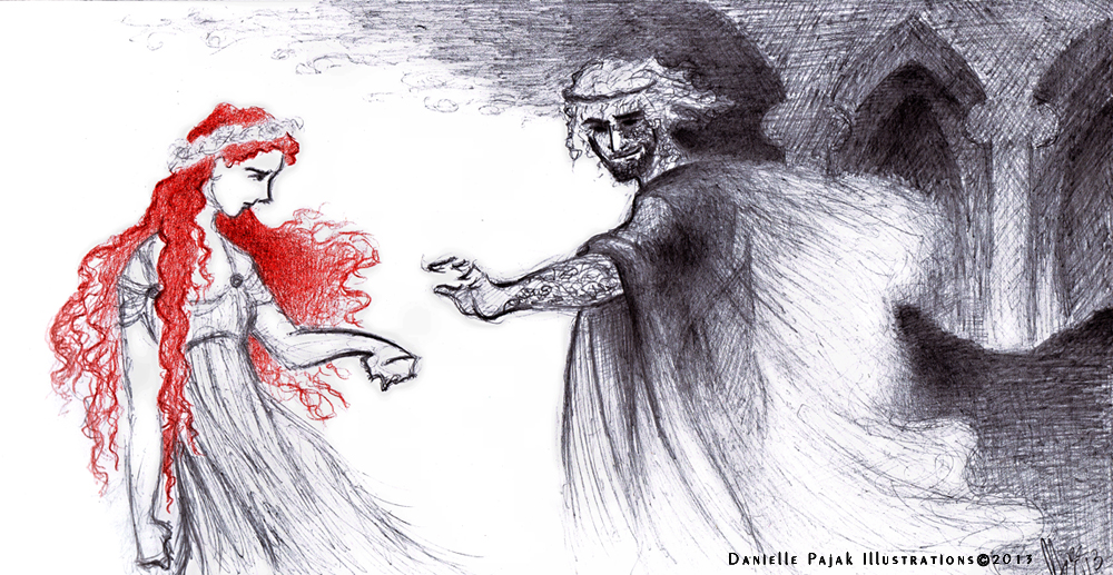
All material in this post is Copyrighted by Danielle Pajak Illustrations 2013.

Sunday, September 22, 2013

Between Rage and Serenity

Still love this poster!
"I believe that true focus lies somewhere between rage and serenity." - Charles Xavier

Before I go on to finish my Avengers Project, I was inspired to do another comic book inspired  piece, this time from The Wolverine. I wasn't expecting too much from the film, (other than the awesomeness that is Hugh Jackman) for my X-men love has been somewhat dimmed of late. However, to my surprise, The Wolverine was quite a good film in many respects, exploring the ideas of the Wolverine's immortality, his inner struggles with his past, and the uncertainty of his future. In accordance with these, one thing that stood out to me was Wolverine's relationship with Mariko Yashida. Granddaughter to Yashida, a man Wolverine rescued during the bombing of Nagasaki now turned CEO of powerful technological corporation, Mariko is inexplicably thrown together with Wolverine through a mesh of power politics in which Mariko finds herself in danger of her life. Wolverine becomes her protector, the very legend her grandfather had told so many stories about when she was a child, whom she now finds to be a haunted and lonely man. He is burdened by countless nightmares and visions of Jean Grey, as he is unable to live with the decisions he has made or the never-ending curse of his immortality. He is paralyzed unable to move forward from his past and having no purpose to continue on to his future, truly a broken man. In this dark state, Wolverine is instantly struck by Mariko's quiet, intense spirit and they slowly fall in love through
The beautiful scene when Wolverine first meets Mariko.
In the Rain. Everything awesome happens in the rain.
the course of the story, but what stands out to me is how Mariko is able to break through Wolverine's hardened outer shell to the man beneath, making him face his past and inevitably giving him the incentive for his future. One of my favorite scenes is when Wolverine awakens violently from another nightmare, his body tense, his claws extended ready to attack, but Mariko lays at his side, not even flinching, speaking to him quietly, and even lightly touching his claws without any fear. Slowly she calms him as she speaks, bringing stillness and serenity to the rage of Wolverine's spirit. It so perfectly illustrated her tranquility that irresistibly recalls Wolverine from the downward spiral of his life. I even love the visual contrast between Mariko and Wolverine, Mariko being lithe and delicate, a fragile thing in comparison to Wolverine's bulk and hardness. It is even interesting to note that when Wolverine first meets her, she is wearing white, the symbol of who she was going to become for Wolverine. It is very much a beauty and the beast type of concept as well, and in the end, Wolverine finds the freedom and strength to move on. It is a beautiful relationship, but subtly and quietly played out in the film, which I very much appreciate.

So, you are probably realizing by now why I chose the quote from X-Men First Class (another good film, by the way). That quote was something I instantly thought of while watching this movie, for Wolverine finds his true focus somewhere "between rage and serenity." In my piece, I wanted to really bring out these concepts. Keeping with the Asian-inspired style of minimalism, I have Wolverine and Mariko standing on either side, Mariko blossoming in the serenity of white, and Wolverine materializing from rage of darkness. The focal point extends from Mariko's face, from the blackness of her hair and gold dividing line to her hands caressing his hand in the sea of red, the red symbolizing the focus between rage and serenity. I've kept everything abstract in design, with rough. illustrative strokes with the clarity coming to the focal point of their hands. I've, of course, added texture, which I think always adds an extra dimension to any piece.


I hope you've enjoyed this post. This piece, along with my Avengers pieces, shall be available to purchase at the Phoenix Comicon next year, so hope to see you there! Information on my booth's location shall be provided soon and in a more official capacity so everyone can find me. Thanks! Here's to September!

He makes everything beautiful in its time . . . Ecclesiastes 3:11

Tuesday, July 23, 2013

July Observations: In Another World

The end of July draws nigh and I've been working hard, but alas I have nothing to show of my main projects.  I am excited, though, to say that I have gotten some significant work done on my graphic novel and I'll most likely have something to show you all next month. I'll keep plugging away, but I can actually see the half way mark in my progress, which is exciting for me. I still have so much to do on it, but I'm making head way and my plans for next year's promotion of my graphic novel might actually be doable. Yay. So, please keep coming back for updates on that! My Avengers Project isn't going as smoothly, however. The Cap is being quite stubborn and there is something about the piece that just isn't speaking to me. It is kind of like beating your head against the wall. After repeated experiences with the lack of inspiration, I've finally learned to just let it go and leave it. It is no use in trying to push something because you end up just wasting your time. I've even done a little pictured demonstration of what happens for everyone's amusement.

Haha. So, I'll probably move on to the green rage monster Bruce Banner and then come back to The Cap later. It's for the best. But now to switch gears on this post; I've been doing some sketches that I've posted on my Pintrest/Twitter, which have been of nymphs and faeries. Just letting my imagination roam free while listening to a lot of Carbon Based Lifeforms (a Swedish ambient music group). Probably one of my top favorite songs ever, though, is a song called "Stolen Child" by Loreena McKennit. It is a song about a faerie taking away a child, which is a common myth surrounding faeries and their mischievous ways. I find it haunting and beautiful, and I often find myself loving this idea of being beckoned away to another world. Whether it be faeries, sirens, the white rabbit, or some other elfin creature, I'm fascinated by this aspect of being drawn by something mysterious or alluring into another world (or death in some cases, haha.) There is such excitement and beauty in being drawn to another realm, to pass through "the grey-rain curtain"of this world to "a far green country" beyond (Lord of the Rings pg. 1007). It reminds me of this verse from Hebrews 11:13-16 "These all died in faith, not having received the things promised, but having seen them and greeted them from afar, and having acknowledged that they were strangers and exiles on the earth. For people who speak thus make it clear that they are seeking a homeland. If they had been thinking of that land from which they had gone out, they would have had opportunity to return. But as it is, they desire a better country, that is, a heavenly one. Therefore God is not ashamed to be called their God, for he has prepared for them a city." It is the idea of another realm beyond this world and of being part of that Otherworld so as to have longing of a stranger in a land not our own, then finding ourselves drawn away, called away by a Voice mysterious as it is beautiful; a Voice surrounded by "clouds and thick darkness," "flashes of lightning, and rumblings and peals of thunder" with "a sea of glass, like crystal" (Psalm 97:2, Revelation 4:5-6). How does this translate into faeries, nymphs, and sirens you may ask? Well, I think C.S. Lewis says it quite brilliantly: "We do not want merely to see beauty, though, God knows, even that is bounty enough. We want something else which can hardly be put into words - to be united with the beauty we see, to pass into it, to receive it into ourselves, to bathe in it, to become part of it. That is why we have peopled air and earth and water with gods and goddesses and nymphs and elves - that, though we cannot, yet these projections can enjoy in themselves that beauty, grace, and power of which Nature is the image" (The Weight of Glory pg. 42-43). With this in mind, I shall always continue to be fascinated by the otherwordly, always following that White Rabbit down the rabbit hole to another world.

So all these ideas swirling around in my head produced these two illustrations I've done in pencil (with some Photoshop magic!):

Come away oh human child
To the waters and the wild
With a faerie hand in hand
For the world's more full of weeping
Than you can understand

"Stolen Child" Loreena McKennit.
Observations in Kensington Gardens
This second one is more sci-fi, surrealist in nature and it was largely inspired by Carbon Based Lifeform's "Kensington Gardens," thus the name. Listening to the song will really help in getting the atmosphere. You'll notice, though, how in both these images I have the veiny, branch-like patterns. One of the things that fascinates me about nature is how the world of the micro and the world of the macro have similar patterns. Whether it is our own arteries and veins, membranes and molecules, to nature's branches, foliage, and creatures, to the makings of a star or galaxy, there are such beautiful similarities in design. I love this aspect to our Universe and love the idea of blurring the line between micro and macro in my artwork. This especially comes out in "Observations" where the scale of things aren't exactly clear. I'll probably want to experiment more with this idea in my artwork, to see what other fascinating concepts I can come up with.

Well, that is what I have for July. Please check out either my Twitter or Pinterest if you are interested in more of my elfin sketches. (Yes, this is what I think about all day.) Don't forget to check back soon for updates on my graphic novel! God bless.


He makes everything beautiful in its time . . . Ecclesiastes 3:11

Thursday, June 13, 2013

Sherlock and The Woman

"To Sherlock Holmes she is always the woman. I have seldom heard him mention her under any other name. In his eyes she eclipses and predominates the whole of her sex." - Dr. Watson A Scandal in Bohemia.

You'll have all bear with me, I'm about to get a little geeky, even more than usual. Also, I've kept this post as spoiler free as I can, but you'll still have to read at your own risk. My best advice? Watch Elementary, then come back to this post. (Yes, do it!)

Inspiration for this post happened when I was perusing the exhibits at the comicon. I saw this piece of art related to BBC's Sherlock that I found to be intriguing of Holmes and Irene. I thought it would be cool if I borrowed some elements of the idea and do something of my own. It got me thinking of the characters and in particular the enigmatic and lovely Irene Adler herself. In the original story, she was the woman who outsmarted Holmes in a case involving her scandalous liaisons with a Bohemian King. In comparison to the aura that surrounds this character today, Doyle's original work is pretty tame. However, despite the grandiose nature of her character, I've never been pleased by any portrayal of Irene. Even in the Jeremy Brett adaptation, (which I love) though very canon in portrayal and beautiful in appearance, Irene was a little dull. Otherwise they usually portray Irene Adler in a very sexual way, very seductive, and always annoying. I was actually surprised, though, by Rachel McAdams, and by surprised I mean I didn't hate her portrayal. She's grown on me, and I do like that they took her character in a more vulnerable route, which I think makes her character sympathetic. However, even with Rachel there is still mostly sexual interplay and annoying self-assertiveness. So, I've not been very impressed by any Irene Adler. That is until Natalie Dormer's portrayal in Elementary. I instantly liked her face (I hadn't seen her in anything up to this point) and was confident that someone finally was going to do her character justice. I was not disappointed. Actually, my expectations were exceeded. Natalie Dormer brings to Irene's character a sophistication, feminine mystique, and most importantly of all, a razor sharp mind on par with Sherlock Holmes; after all, it was her wits that impressed Holmes, not her sexual appeal.

"You're beautiful!," says Irene
to the unsuspecting Sherlock Holmes.
In Elementary, Holmes is a recovering drug addict, self absorbed and somewhat childish, but with an exceptional gift of deduction and seeing the must minute of details. His love for puzzles makes him unyielding in a case and blunt in speaking the truth, whether anyone wants to hear it or not (TMI!). When he first meets Irene she is a restorer of old paintings and her own bluntness and disarming mind and beauty impresses him immediately. I love the almost old Hollywood-esque sharp banter between the two of them as Natalie Dormer is able to show the sensuality and seduction of Irene in a way that accentuates her intelligence and femininity, which is rather like the femme fatales of Film Noir. Natalie Dormer actually reminds me a lot of one of my favorite Film Noir actresses, Gloria Grahame. She has the same quality about her, the mischievous and intelligent eyes and impish face that makes her either vulnerable or untrustworthy, but carries an irresistible attraction that is all woman. With this quality about her, Natalie Dormer makes you truly believe that Irene is someone Holmes would say "eclipses and dominates" her sex. I would like to mention Johnny Lee Miller's performance further sells this point. Holmes is completely smitten by her. It's cute. . . in a disturbing way.

See what I mean?
All this to say that I did two pieces of work based on Guy Ritchie's Holmes and Irene and Robert Doherty's Holmes and Irene; more character studies, I guess you can say. The first one, Catatonic:


I wanted to bring out the vibrancy, passion, and disturbance that Irene brings to Holmes' world which is usually controlled and logical. Irene challenges Holmes, but there is definitely a mutual attraction and love between the two of them; though Holmes keeps his distance, showing his true feelings in only fleeting moments. As Watson says, "Why is the only woman you've cared about a world class criminal? Are you a masochist?" Haha. This version of the characters is the farthest from canon, but it is clever, actually rather sweet, and great fun. I am awaiting eagerly for the third installment!


In this piece, Games and Puzzles, show an entirely different kind of relationship dynamic, also not canon, but I think an impressive interpretation. Here Irene is in white to represent how Holmes sees her, an ideal, someone whom he loves intensely and unreservedly. Here he is moving towards her, grasping her, as if to keep her as he sees her, but she keeps her distance. She looks vulnerable, but is she? I love the darker interpretation of the Sherlock Holmes universe in Elementary, it is very poetic, but Holmes is still Holmes, and what is revealed in this complex relationship, I think, is very much in the spirit of Sir Conan Doyle's work.

Well, I hope you enjoyed this very nerdy post and art pieces. Gotta love the world of Sherlock Holmes.

"My mind," he said, "rebels at stagnation. Give me problems, give me work, give me the most abstruse cryptogram, or the most intricate analysis, and I am in my own proper atmosphere. I can dispense then with artificial stimulants. But I abhor the dull routine of existence. I crave for mental exaltation. That is why I have chosen my own particular profession, or rather created it, for I am the only one in the world." - Sherlock Holmes Sign of the Four


He makes everything beautiful in its time . . . Ecclesiastes 3:11

Wednesday, May 29, 2013

Persephone and Hades II: Another Random Concept Piece

So, over the weekend I attended the Phoenix Comicon. Thanks to all those who voted for me in the badge art contest, I was able to win two free passes to the comicon! I was happy to be able to go with my brother and my cousin. I love the Phoenix Comicon. It is full of nerdy fun, great atmosphere, and you never know what is going to happen or what type of people you are going to meet. I particularly love walking through the exhibition room where there are hundreds of booths of artists and merchandise to peruse. I actually met some lovely artists, particularly one artist named Lyla Warren. She has a lovely style, working in both animation and sculpting, and her pieces are full of movement and character. I'm happy to say I own some of her work, which is now on my "wall of crazy", and I would recommend anyone to go check out her website, blog, and Etsy shop!

What does this have to do with another concept piece of Persephone and Hades you might ask? Well, at the comicon I went to a panel that had animators and artists for video games and films that were doing a Q & A type session to help artists who are desiring to get into the industry. They were very helpful, friendly, and of course knowledgeable in their field. The advice they gave me I am already doing, which is good to know, but  I also sensed that I should probably step it up a notch, as far as drawing goes. Being a concept artist means drawing all the time. The one panelist mentioned 40 hours a week should be the kind of work I should be putting into drawing, which is a full time job. It is true. You have to keep up the practice and drawing is a constant learning process of refining the skill. I have no qualms about how much hours I put in, but of course, what is doable is the question. I think I already put in at least 20 - 25 hours a week, so I'm going to see if my life permits me to add more in. So, as the summer goes on, hopefully you'll be able to see more work from me! For now, enjoy this concept piece of Persephone and Hades. For some reason I was struck with inspiration again with these two characters and came up with this piece. I don't know if I'll be doing anything with these characters in the long run, but there is definitely something compelling about them.

"Persephone, meet Cerberus." - Hades is kind of a jerk.
Oh, before I end this random post, I would also like to mention that another great thing about this year's comicon is that my cousin and I were able to promote our webseries, The Sting Chronicles! Production is going well, promotion is going well, and the scheduled air date is June 7th! We are all very excited! So, don't forget to check it out on Youtube!

He makes everything beautiful in its time . . . Ecclesiastes 3:11

Friday, May 10, 2013

Persephone and Hades: A Random Concept Piece

"We dance, we kiss, we schmooze,
we carry on, we go home happy."
The other day I was watching Disney's Hercules, and admiring the artistry and excellence of that film. I haven't seen it in many years, I can't remember the last time I'd seen it, but watching it with fresh eyes I really was able to appreciate the humor, the art direction, the music, and the wonderful characterizations. It is definitely one of my favorite Disney animations. One of my favorite things about that film, though, is the villain Hades and his Underworld. He is definitely a different type of Disney villain, and one that stands out as truly unique. Unlike other villains, there isn't decisive destruction, an absolute end to him. His plan is foiled and he gets trapped in the whirlpool of death, but he is immortal and god of the underworld, so he can't really be destroyed entirely. Even more than that, though, he's hilarious and zany. I like the tongue in cheek humor of the film, which is due in large part to Hades characterization. He's the fast-talking, deal-making, god of the underworld and you can't really dislike him all that much because he's funny. His character design, is excellent, with his hair flames ("Whoa, is my hair out?") telling of his mood and his greek-esque hulking figure with swirling smoke and snake-like face that really emphasize this sinister, quick-tongued villain. The underworld in which he is charge is also amazingly designed. I need to get the Art of Hercules to really be able to study the concepts behind all of this, but I do have a fascination for the dark and macabre and there is a lot going on here in this design work:

"While the angels, all pallid and wan,
Uprising, unveiling, affirm
That the play is the tragedy "Man,"
And its hero, the Conqueror Worm."
- Poe
Anyway, I can geek out about this all day. Needless to say I was inspired, and it got me thinking about Hades and the tale of Persephone. In the Greek myth, Persephone is the daughter of Demeter (goddess of the harvest) and Hades sees her, desires her, and kidnaps her. After much angst, Hades is finally forced to return her, but tricks Persephone into eating some pomegranates from the underworld before she leaves. Eating food from the Underworld makes her a part of it, so she must always return to the Underworld and be by Hades' side as his queen. Thus this is why, as Greek myths go, we have winter every season, when Persephone has to return to her place as Queen of the Underworld. I thought all of this could be really fascinating as a retold story, a twisted and dark "Beauty and the Beast". It was also reminding me of Once Upon a Time's Rumpelstiltskin and Belle, this idea of an anti-hero and his journey from darkness to light. It would be done even deeper way than simply just "don't judge a book by its cover" concept. Hades would truly be, in many ways, despicable and unlikable, but as anti-heroes go, there is hope for redemption and who doesn't like a good anti-hero now and again. So, I just let myself imagine what that story would be like and the characters and I came up with this concept piece:


Maybe one day this will be animation masterpiece of death, vanity, true love, redemption, responsibility, and the human condition, but for now I just have this piece. Enjoy!

He makes everything beautiful in its time . . . Ecclesiastes 3:11

Tuesday, April 16, 2013

The Sting Chronicles: Superhero of Arizona

This summer is going to be full of new projects, some old ones, and is going to be wonderfully productive. I'm pleased to announce one of the new projects I'm going to be a part of. In collaboration with my cousin Alexis Johnson (Reel Reflections), actor, film critic Radcliff Misseri (actor of Sundown, mentioned in my post here), a group we are assembling together, and I will be creating a Youtube webseries called The Sting Chronicles. It is a satirical, coming-of-age story of a young man who thinks he has superhero powers and records his adventures via video records. It seems as if webseries are going to launch creativity in media into a whole new sphere, Youtube full of webseries cropping up to popularity, and I'm happy to be a part of this new media outlet. One of the main inspirations for this webseries is the new, highly innovative adaption of Jane Austen's novel, Pride and Prejudice, The Lizzie Bennet Diaries. It records the story of Lizzie Bennet, a college student studying Mass Communications, as she recalls to her audience the antics and drama of her life with her family and friends. It is a very clever, heartwarming, and downright hilarious retelling of Pride and Prejudice, there is nothing like its kind out there. Using the internet as a mode for storytelling, but have the story be told as if it is actually a real-life scenario is ingenious and we hope we can capture that same spirit and connection with the audience that the creators of the Lizzie Bennet Diaries have achieved with their webseries.

So, I begin with my work that I've done so far on this project, and it starts with The Sting logo. As I said, this young man feels he has gained super powers, and in this case the story is set in Mesa, Arizona, and he happens to get stung by a scorpion, thus The Sting is born. The Scorpion logo design concept is a collaboration with Alexis Johnson, as she wanted something that would look menacing, but unique. With my own love for Art Nouveau, studying many pictures of scorpions, and with a touch of Celtic knot influence, we both came up with this idea:


We purposefully chose the yellow and black, because we are going for this aspect of "Danger". With reptiles and insects, there are the colors red, black, and yellow to warn other creatures that they are dangerous and poisonous, and so in this way the main character, Ethan Harper, is using this idea as a way to show he is a threat to all crime; a blaring "Danger Ahead" symbol fighting for justice! Of course, as a final touch, and as is my usual staple, adding texture adds that rustic edginess, which fits to the "wild west" atmosphere of Arizona.

Continuing with these themes, I then came up with a concept piece of the character himself, also in collaboration with Alexis Johnson. She is the writer of this series, and so much of the ideas and concepts are her own, and so she and I both agreed that this character's superhero costume would have the feel and look of Indiana Jones crossed with The Punisher. There were other influences as well, Dr. Horrible's Sing-Along Blog being one of them, but Indiana and Frank Castle were what I drew from the most while creating my piece.


We have the roguish, rustic adventurer mixed with the edgy, city superhero, and the results:


One of the key aspects of our Arizonian superhero is his bullwhip, which is how we draw the idea of the "scorpion" into his superhero persona. The stinging whip is how he battles against the forces of darkness and keeps criminals at bay! The rest came easily enough, and with high contrast, lots of texture, and simplistic design, we have our superhero ladies and gentlemen.

It is certainly going to be an adventure in bringing this story to life. As my viewers, you can have a chance to be a part of bringing this project to fruition. We are currently doing two fundraisers to raise money for the project, and it starts at a $1 minimum pledge. Alexis Johnson and Radcliff Misseri have put together a video where you can learn more information on this project as well as get to know our vision and sense of humor. Click Here. You can find out more information as well as keep up with the project on our Facebook page. 

I'll keep you up-to-date on any new artwork on do on this project, but I do hope you'll join us in bringing Ethan Harper, our desert crime fighter, to life. 


He makes everything beautiful in its time . . . Ecclesiastes 3:11

Friday, March 15, 2013

Long Ago Surrendered...

This week I've been really focusing on getting a lot done in regards to promotion of my artwork. Not everything has worked out as planned, but I'm excited for future opportunities. Right now, I want to showcase my new graphic for my blog, and the journey behind the making of it. I will soon be printing business cards for myself and this is part of that process.

During my education at my college I had to make a branding logo for myself along with a business card, letterhead, etc. This was all part of the learning process, and the name I had come up with was Ixia Illustrations. Ixia is a flower and it lent itself well to the Art Nouveau style I was going for with my name brand. However, as time went on I realized that this particular logo, though pretty, wasn't what I wanted to symbolize as myself. Ixia flowers were just a random flower I discovered and meant nothing to me or to my artwork. It wasn't until one day on Facebook that a friend of mine asked in her status if there was one symbol you could choose for yourself, what would it be? Her answer was a thistle. From there, I began to brainstorm, because her love for thistles was very much like my love for dandelions. I've always loved them, ever since I was a little girl. Yes, they are weed, but a beautiful one! I love picking them and blowing them, and always get excited when I see one. I decided, then, that the dandelion was a perfect symbol for me as an artist, and not just because I love them so much.

"The dandelion has long ago surrendered its golden petals, and has reached its crowning stage of dying - the delicate seedglobe must break up now - it gives and gives till it has nothing left... There is no sense of wrenching; it stands ready, holding up its little life, not knowing when or where or how the wind that bloweh where it listeth may care it away. It holds itself no longer for its own keeping, only as something to be given: a breath does the rest, turning "the readiness to win" into the "performance" (2 Corinthians 8:11). And to a soul that through "death oft" has been brought to this point, even acts that look as if they must involve as effort, become something natural, spontaneous, full of "heavenly involuntariness," so simply are they the outcome of the indwelling love of Christ." - Lilias Trotter.

Lilias Trotter was a kindred spirit of mine who lived in the late 1800s and she was an artist turned missionary to the people of Algeria. She had a chance to become a great painter of her day, but chose instead to serve Christ in Algeria and spread the Gospel there. Yet, it was because of her being an artist that she was really able to speak to the people there, who loved bright colors, storytelling, and visual imagery, and so her talent was used quite grandly after all, though just not the way she might have originally thought. (You can purchase a lovely book of her images and quotes here) With her lovely images and story of her life in my head, I read this quote above and it really spoke to me. I desired to live my life in that way, surrendered and free, to have what I do with my artwork really express that love and freedom in Christ. I've known my talents and what I "wanted to be when I grow up" ever since I was a little girl, and it has stuck with me through the years, only growing more and more as the time passed. I know this is my calling, and that it will one day take me to a different world entirely from my own right now, and I want my heart and my artwork to express that "readiness" and "heavenly involuntariness." I've long ago surrendered.

So, I decided to change my logo and go ahead with this idea of the dandelion symbol. However, as I began to recreate my logo I was running into issues with the design. It wasn't conveying at all the idea I was trying to get across. I actually dislike designing logos. They are so difficult in their simplicity! They must always remain readable at any size you make them, which means the design cannot be too complex. Yet at the same time it must represent the persons, company, and/or vision. I don't like it very much, and so after much frustration, made the big decision that I won't be using a logo at all. It isn't as necessary for me as a freelance artist, especially now with the world of the Internet, and how you can network and promote yourself in an nontraditional way. Business cards aren't even that necessary anymore when everything is accessible at your fingertips! Once I made that decision, the ideas began flooding in! I then came up with the design that you see now on my blog. Here is a bigger view of it:


The delicate seedglobe surrendering its petals. I wanted this image to convey my whimsical, day dreamy nature while at the same time, showcasing the symbol of the dandelion which is the insignia of my work. One image I was inspired from was this Vanity Fair magazine cover from the early 1900s, an art deco piece that I have hanging on the wall of my room:


I love this image! It is so whimsical and full of movement. The colors are vibrant and the line work delicate. I really wanted to capture this dreamy atmosphere within my own art piece. Strangely enough, though, I've come full circle because it came to my mind my very first illustration that I ever created when I was in school. It is when I really began to understand Photoshop and it became a turning point in my journey as an artist:


So you can see that my first illustration began with dandelions and now on the cusp of my career as an artist, dandelions have made their way in again! Me thinks it is not all just a coincidence. 

I've hope you've enjoyed my story on the process of this piece and that you enjoy looking at it as part of my blog design. My business cards will be incorporating this new design as well and the way I see it now, this image represents me as an artist. It may be unconventional, but it fits perfectly.

Thursday, March 14, 2013

Sherlock and The Phoenix Comicon

Well, after years of people telling me I should enter art contests, I've finally have. I'm sure it is no surprise that it is a contest in connection with the Phoenix Comicon. I've only been to the comicon once and it was my very first time experiencing the event, and I have to say I loved it. (Of course.) In 2011, I went with my family and friends and got to dress up as Padme Amidala, hear Leonard Nemoy, Adam Baldwin, and Billy Dee Williams (Lando Calrissian) speak, have fun with Doctor Who fans, and peruse lovely artwork and nerd merchandise of all varieties. (Firefly and tea?! Who could ask for more: Serenitea) I've been wanting to go back, but haven't had the chance. However, in my email I get the latest Phoenix Comicon news, and it was late last month that I found out about the art contest they do annually for the comicon. You see there are different memberships for the comicon, Full Day pass, Sunday pass, Saturday pass, Volunteer pass, etc. When you purchase a membership, you get a badge to wear during the comicon, and on these badges they have all sorts of artwork. When I went, I was happy to get a lovely piece of fan art of Quorra from Tron: Legacy on my badge. So, apparently they hold a contest every year for local artists to compete and get their artwork on these said badges. I was super excited when I found out! I would love more than anything to get my artwork on a badge for the Phoenix Comicon. It may not seem like such a big deal, but to me as a fan, I love it. If there is one thing I will never lose is my love for fans precisely because I shall always be a fan myself. I've sent in my piece, then, and I shall know soon if I pass the First Stage of the judging process. This contest has three stages of judging, which is one of the reasons why I'm blogging about this now. If I get through the First Stage, then in the Second it is up to the public to vote. I will need the support of all you in that part of the competition, so I'll keep you updated on the whole thing.

Now on to my actual art piece. I would have thought up lovely ideas for Avengers or Star Trek, but I figured that they would most likely have many entries about those as well as other comic book related material. I decided then to go with Sherlock Holmes because first of all, I love it and secondly, all things Holmesian have risen to popularity. With the release of Guy Ritchie's excellent Robert Downey Jr. and Jude Law version to the modern retellings in BBC's Sherlock and CBS's Elementary, everyone is crazy for Sherlock Holmes and his loyal companion John Watson. I've recently become a huge Elementary fan, so I thought it would be perfect to create a Sherlock Holmes piece. I thought it would probably be more fitting to keep it in Guy Ritchie's universe, though, with the visage of Robert Downey Jr. So, I came up with this idea:


It was a little bit of a challenge because they require you to have the art piece in two different sizes, horizontal and vertical, so I had to make sure this design worked in both. 


I actually had to recreate the smoke for the two different versions, but I think they both work well in composition and movement. I must always have movement in my piece! As for the rest, I kept with the metallic, artsy, grunge theme of Ritchie's Sherlock Holmes, with the shadowy color scheme, ink-styled drawings, and lots and lots of texture. Another thing I kept in mind is one of the things I have observed about previous badge art for the comicon which is that they usually chose art pieces with a lot of contrast and/or color. It makes sense, seeing as a lot of comic book artwork is colorful and graphic. So, with that in mind, I added in the punch of red in different elements to really draw the eye across the piece and engage the viewer. I think it came out very punchy and graphic, and I love the texture of it. I've titled this piece: Sherlock Holmes: It's Elementary. With the puff of his pipe, Holmes can solve any crime in the streets of London (or New York), and it is all just elementary

I hope to be able to announce more good news as time goes on. Thank you for viewing and I hope you've enjoyed this!

******UPDATE******UPDATE******UPDATE******
3-26-2013

I'm excited to announce that I have made it to the second round, which is the voting process! I will be needing every vote I can get, so please come and vote for me at:


Here are the directions:

1. You can use your Facebook or Twitter to login, but you can also create your own unique login name with your email and they'll send you a password. 
2. You are able to vote for me every day, so it isn't just a one time voting process.
3. Voting is open until April 21st.

Thank you so much!

******UPDATE******UPDATE******UPDATE******
4-29-2013

I'm thrilled to announce that I won the contest! A shout out thank you to all who have voted for me and made it possible for me to win this contest. My artwork was used for the "Press" Badge, which is fitting. You can view the winners Here. Thank you all!


Wednesday, January 30, 2013

Illustrations of Earthsea

If you've been reading my blog, it has probably become apparent what I love to read and watch, what inspires me and fuels my imagination. Avengers to Isaac Asimov and now to Ursula K. Le Guin. I adore her Earthsea Cycle. Though I haven't finished reading all the books in the series, her style is very old school (i.e. C.S. Lewis, J.R.R. Tolkien, and George McDonald), and her tales of Earthsea are haunting and rich with the traditional folklore of wizards, dragons, and magic, but have a lot of philosophical depth and originality. I love that her stories are driven by the characters and their inner growth, rather than the externals, i.e. the wizards, dragons, etc, yet all of it is thoroughly developed and woven together. Of the books I have read, I loved every one, but something particularly drew me to The Farthest Shore, which is the third book in her series. It is centered on the Archmage Sparrowhawk (or Ged as is his real name) and the young prince Arren and their quest to save the world as they know it from a great Darkness that is undoing all things. Pretty traditional, but her execution is not as the story follows these two characters. I find it rather reminiscent of the journey Frodo and Sam take into Mordor in The Lord of the Rings, as the Archmage and Arren meet many trials on their journey into the Dry Land (the place of the Dead), and sacrifices are made. The book approaches ideas about Death and Immortality, but also of personal growth. Simple, but somehow profound through its telling. It is mournful, ethereal, but not without hope. The imagery really stuck with me, and so when taking an advanced drawing class at my college, I decided to do 5 illustrations for this story.

The illustrations had to be large format, 18 x 24, which is not traditional for me. I also used charcoal and white conte, which is not my normal medium. It was challenging for both these reasons and since I was working on a colored paper, which would serve as my medium tones, and had to work in the darks and lights with the charcoal and conte. It was a little awkward because I usually build up my shading by many, many layers of light shading, so going from light to dark, but I sought help from a great early 20th century illustrator (my favorites!) Elihu Vedder and his work on the Rubaiyat. It is hard to find really good examples of his work on the internet, but I once saw a show where they had all of them displayed at my local art museum, and they were absolutely stunning to see in person! Here are just two examples:


He worked with the medium toned paper, building his dark and light value tones. His touch is so soft and subtle, and I love the movement he creates in his figures as well. In these two examples, the one on the left you are drawn in by the twisted arms of this angelic creature leading this young woman. Your eye follows down the delicate twists of his cloak and her dress, but then you are drawn upward by his wings. On the right, the weeping woman's contorted body becomes one with the swirling contortion of the cloth around her. It is so elegant in its execution. There was just something about those early 20th century illustrators in the way they were able to capture the emotion and power of stories, fairytales, and poetry in their use of line, texture, and subtle hues. Normally they had a very minimalistic color palette, or at least from those I am usually inspired by, and I think that adds to the atmosphere and power of their art.

My main source of inspiration for my illustrations was Elihu Vedder, but I also drew from Gustave Dore and Arthur Rackham, who I've spoken on before. Here are examples:

"The Destruction of the Levithan" by Gustave Dore
& "Undine" by Arthur Rackham
Gustave Dore was an illustrator who mostly worked in engravings, which I think is so impressive considering the scope and detail he was able to achieve. Looking at the example I had here of the leviathan, you can see the drama he creates with movement and line. The swirling mass of leviathan and water is so dynamic and it is all engraved into a wood block! Arthur Rackham's work is just gorgeous, and what I love is that in many of his pieces the characters almost become one with their surroundings, by the uniform of color, movement, and lines. In this example Undine is blown by the wind into the very landscape of branches and forest growth. It is otherwordly and rich with detail.

With these images in mind, I began my work. They are listed in chronological order of the story and I have below each of them the excerpts that I chose.

"The oarsmen sat like carved statues.
Crewmen stood in the waist of the ship, their eyes shining a little.
Alone on the port side stood a man, and it was  from him that the light came,
from the face and hands and staff that burned like molten silver.
At the feet of the radiant man a dark shape was crouched."

"He was running the darkening gloom, faster and faster, around the sinking
inner lip of a pit, an enormous whirlpool sucking down to darkness..."

"As he gathered brushwood for their fire in a creek-valley, in that red light,
Arren glanced up and saw a man standing not ten feet from him.
The man's face looked vague and strange, but Arren knew him,
the Dyer of Lorbanery, Sopli , who was dead.
Behind him stood others, all with sad, staring faces. They seem to speak,
but Arren could not hear their words, only a kind of whispering blown
away by the west wind. Some of them came toward him slowly."

"With all the skill of his life's training and with all the strength of his fierce heart,
Ged strove to shut that door, to make the world whole once more."

"When Arren woke, a grey fog hid the sea and the dunes and hills
of Selidor. The breakers came murmuring in a low thunder
out of the fog and withdrew murmuring into it again."

I really wanted to make the surrounding atmosphere strong around these characters, with swirling clouds, water, or stone, and the characters flowing with it as one. This is how I felt while reading the book, her atmosphere thick with the Darkness that was invading the land. It was isolating, cold, and mysterious and this effected the landscape. I kept with the movement of the lines, clouds moving into sky, into water, into stone, into cloth, into trees, etc which creates a steady rhythm. In this way, I feel that it heightens the feeling of the fantastical, making the landscapes like dreamscapes, more surreal and magical. This movement is something that I felt was key in the early 20th century illustrators that I've listed above and one of the reasons why I'm so drawn to their work.

So, despite my often frustrations in working with charcoal, I enjoyed creating these pieces. I hope you have enjoyed them as well. My next posts I hope to be able to share new pieces, but seeing as this month was so busy for me, I thought it would be a good opportunity to show some earlier work that I don't usually get to show. It was also a great excuse for me to photograph and make this into digital copies. Anyway, please come back in a few weeks, and have a good February!